How to Write ‘Scannable’ Online Content (4 Quick Tips)
If you crack open a book now, and compare its formatting to most articles on the web, you’ll notice a lot of significant differences. We’re not just talking about comparing paper to screens either, but about the way that we display content on the web.
Online content needs to be highly ‘scannable’. That means readers should find it easy to jump from one section to another, and locate the information they want quickly. The more scannable your content is, the more engaged your website’s visitors will likely be.
In this article, we’ll talk about the concept of scannable content, and we’ll break down how you can adapt your work to that format. Let’s get to it!
What Is Scannable Content?
To understand the concept of scannable content, we need to talk about how people read on the web. When you’re reading a book, you probably don’t skip through any of the content or words. That would be cheating, and you could miss out on key information.
If you’re reading an article on the web, however, you’re much more likely to skim it. That means jumping from section to section, and focusing only on the essential details you care about. That poses a problem if you like to publish a lot of long-form content, because visitors are liable to miss out on important information.
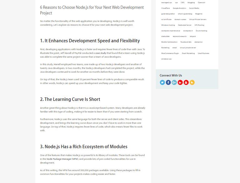
The most practical solution is to adapt your content to how people read on the web, by making it more scannable. If you want an example, take a look at this post from our archives, seen from a bird’s eye view:

As you can see, it’s broken down into multiple sections, so you can quickly jump back and forth. Readability on the web really boils down to formatting. There are a lot of tricks you can use to ensure that your content adapts to the way people read online, so it’s only smart to use them.
How to Write Scannable Content Online (4 Quick Tips)
You don’t need to change the way you write to create more scannable content. However, you may need to make some changes to your online formatting. Let’s go over the most critical factors to keep in mind.
1. Use Subheadings Liberally
If you count them, you’ll notice that this article contains seven subheadings. That might seem like a lot, but the fact is that each of those sections covers a specific topic. As a rule of thumb, every time you change topics within an article, you’d do well to add a new subheading.
Keep in mind that you want those subheadings to follow a natural structure, like this:
- Start with H2s for major sections
- Use H3s for subdivisions within H2s, and so on
We don’t mention H1s, because you should only use those for content titles. That means H2s and H3s will be your workhorses, so getting acquainted with them is a great idea. By using subheadings liberally, you make it easy for readers to skip to the sections they want.
Even better, search engines love subheadings. They look at these closely to get a better idea for what topics your content covers. Ideally, every subheading will mention precisely what the section’s contents are, which is excellent both for Search Engine Optimization (SEO) and scannability.
2. Write Shorter Paragraphs
Long, dense paragraphs are some of your worst enemies when it comes to formatting content online. The longer your paragraphs are, the more difficult it is for readers to skim through them.
Put together multiple dense paragraphs, and your content can become downright fatiguing to read. Breaking up dense paragraphs, on the other hand, makes your content more skimmable. It’s also less fatiguing on the eyes, because you’re including more negative space (or ‘white space’).
There’s no rule of thumb when it comes to the specific length for each paragraph. After all, the way content looks will vary a lot, depending on what device your readers are using. Once you start looking for them, though, you’ll notice that you can find a lot of opportunities to break up long paragraphs.
Every time you change the subject – but it doesn’t merit a new subheading – it’s the perfect time to add a line break. Our advice is to pay attention to paragraph length, but don’t obsess over it. You don’t need to ‘dumb down’ your writing to make it more scannable – simply look out for opportunities to break down long jumbles of words and you’re golden.
3. Include Plenty of Visual Aids, such as Lists, Tables, and Images
It’s a common joke that some people won’t crack open a book unless it has tons of colorful pictures. On the web that holds true, but it’s not necessarily a bad thing.
Visual aids, such as images, lists, and tables, can benefit your content in a lot of ways:
- They provide you with opportunities to break up long paragraphs
- You can use them to illustrate points you’re trying to make
- Tables are powerful tools to convey complex sets of data
Visual aids help make your content both more scannable and engaging. As far as we’re concerned, if you can make a point using a list, why would you choose a boring paragraph instead?
When it comes to pictures, however, we recommend against adding them just to pad out your content. Every image within your pages and posts should help convey a point or show an example of what you’re talking about (and don’t forget about proper attribution!).
With most content, you’ll find plenty of opportunities for including visual aids. Once you start looking out for them, your posts should become much more scannable.
4. Format Your Content for Mobile Devices
These days, most of your traffic probably comes from mobile devices. If you’ve ever tried to navigate through a long-form article using a small screen, you know it can be a pain if it’s not formatted correctly.
In a lot of cases, if your website provides a poor reading experience on mobile devices, those users will walk away. That means mobile content optimization should be one of your top priorities.
Here’s the good news: If you follow all the advice we’ve gone over so far, your content should already look pretty good on small screens. One aspect you’ll still want to pay special attention to is negative space, however.
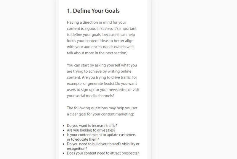
Whenever you publish new content, take a minute to check out how it looks on mobile:

If the content appears too dense, then you need to look for opportunities to revisit all the tips we’ve covered so far. Keep in mind – your website’s style and typography choices will also significantly impact the mobile experience. If you feel that your content is highly scannable, but it still doesn’t look that great on mobile screens, it might be time to consider a website redesign.
Conclusion
The idea that the internet has destroyed our attention spans is everywhere these days. It may or may not be correct, but ensuring that your content is easy to read can’t hurt.
If you’re not sure how to write more scannable content for your website, here are four quick tips to help you get started:
- Use subheadings liberally.
- Write shorter paragraphs.
- Include plenty of visual aids, such as tables, images, and lists (like this one!).
- Format your content for mobile devices.
Image credit: Pixabay.
