Restaurant Website: 3 Tips For Creating An Excellent Site
These days, most restaurants have some sort of online presence. However, not all of them manage to create websites that are both enticing and usable. That means your visitors might have a hard time finding the information they want, and you could lose out on a lot of potential customers in the process.
The best kind of restaurant website needs to encourage people to visit the location as soon as possible. It should be simple for them to find your contact information, and even make a reservation online if relevant. If you can manage all that while still creating a gorgeous website, you’ll be well ahead of the curve.
In this article, we’re going to talk about what makes for an outstanding restaurant website, by discussing some of our favorite examples. Then, we’ll give you a few tips to help you ensure that your site stands out. Let’s get cooking!
What Makes for an Outstanding Restaurant Website

Ideally, you want every website you work on to look stunning, and to be as easy to use as possible. This is particularly true for your restaurant website. Let’s discuss some of the key elements your site should include if you want to turn interested visitors into customers:
- Your restaurant’s menu: After all, a lot of people visit restaurant websites wanting to check out what the options are and to get a feel for the prices.
- Pictures of your food and ambiance: There’s no better way to entice people to visit than by using gorgeous photographs of what you have to offer.
- Contact information and hours of operation: Especially if your restaurant requires reservations, including contact information is a must.
Next up, we’re going to talk about the right way to include these elements on your website. We’ll also provide some examples, to help you figure out what works and what doesn’t.
3 Tips for Creating an Excellent Restaurant Website
The number one mistake most restaurant sites make is putting too much focus on style over usability. Websites provide you with a lot of flexibility about the elements you can add, but it’s easy to lose sight of what’s important in the process. Simplicity is going to be a recurring theme throughout this section, so try to keep that in mind while planning out your own site.
1. Include Plenty of Pictures of Your Food and Location
Offering pictures of your dishes and restaurant is by far the most effective way of making people want to visit your establishment. Some restaurants make the mistake of showcasing their menus but not including photographs, or using too few images throughout their websites in general.
Other sites will include plenty of pictures, but hide them behind clunky menus that are difficult to navigate. Or they’ll use shots that are too small or poor quality for viewers to appreciate the details. There are a lot of ways to drop the ball when it comes to the proper use of images on a website, and it’s important that you avoid them.
One site that does an excellent job in this respect is The Monocle Cafe:
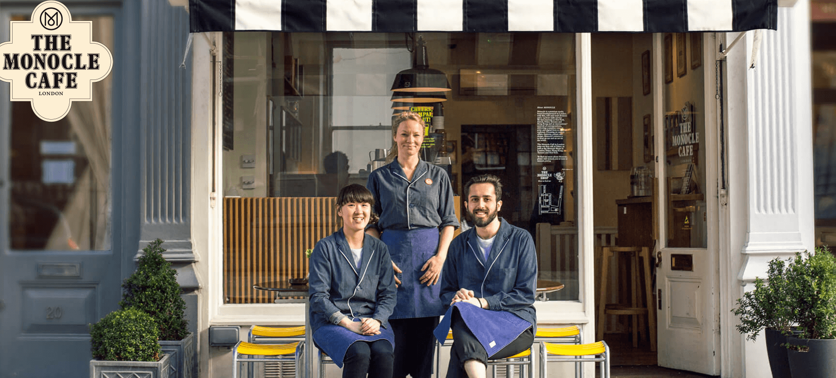
The first thing you see when you visit is a picture of its friendly staff. Scroll down further, and you’ll notice that it includes a full menu, with prices and accompanying pictures. That’s a perfect combination:
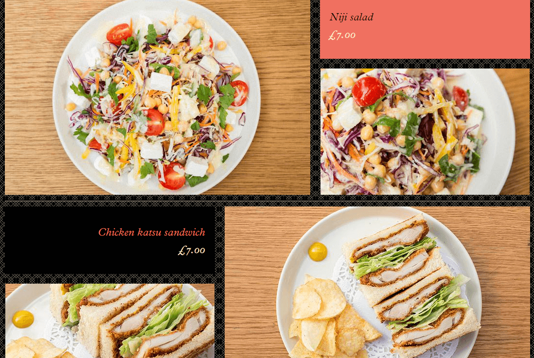
Of course, this approach only works if you have a small menu, so a smart alternative is to feature some shots of your best and most popular dishes. In any case, your whole website should be peppered with images, instead of relegating them only to your home page or a dedicated gallery.
2. Make Your Contact Information Easy to Find
Potential customers will often visit your website to find basic information. They may want to know how to get to your restaurant, when it’s open, and how they can get in touch. If that information is hard (or impossible) to find, those visitors could become frustrated and leave.
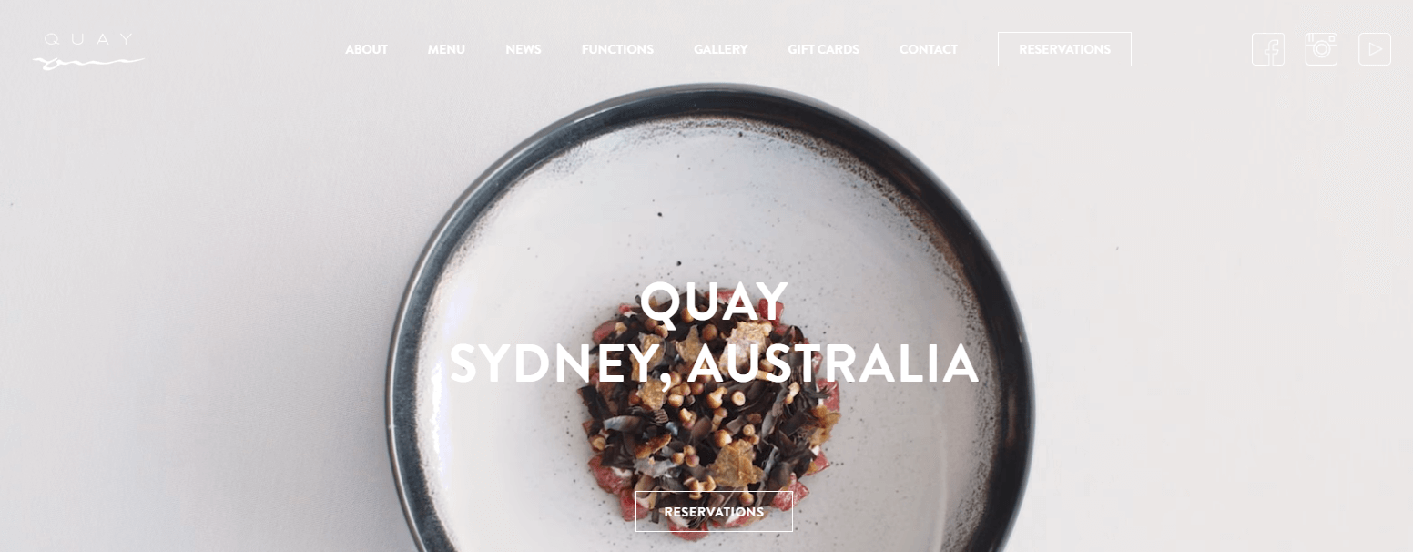
We recommend including all this information on your site, and making it easy to find. It’s also smart to shine a spotlight on links to your social media profiles, which will often be the primary way people keep up with your restaurant. For example, The Quay places these icons at the top of the site, making them prominent (although it could stand to use a bit more contrast in order to highlight them):
Another website that does a fantastic job when it comes to showcasing its contact information is Big Apple Hot Dogs. Its whole main header is a map showcasing the restaurant’s location. This looks quite stylish, while remaining informative:
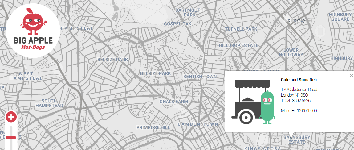
In most cases, the best approach is to place all your contact details ‘above the fold‘, so visitors don’t miss it. However, your footer and sidebar are also valid options, as long as you make sure the information stands out from the rest of your site’s elements.
3. Showcase Your Menu
It can be a lot of work to include a full menu on your website, particularly if you update yours often. When people see menus, they also expect to be able to check out prices and even nutrition information, which requires significant effort on your end.
However, the benefits of including a menu on your website far outweigh the downsides. A lot of people will visit your site to plan ahead, and including a full menu can help them find dishes they’ll enjoy and check out your prices.
Two common mistakes restaurant sites make with menus is to display them as PDFs or images, as in the example below:
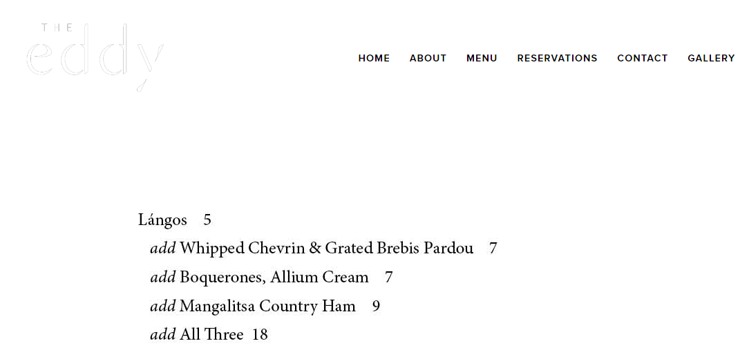
The first approach means that users will need an external application to download and view your menu, which can be a hassle. One the other hand, using images might enable you to design a gorgeous menu, but updating it will be much harder.
We’re fans of keeping things simple, so we recommend using lists to display your menu items and their respective prices, like The Quay does:
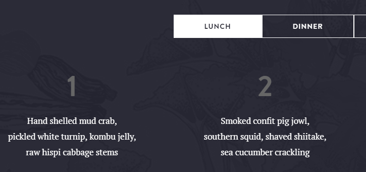
Another valid approach that looks stunning is to use simple tables, like on the Giraffe World Kitchen site:
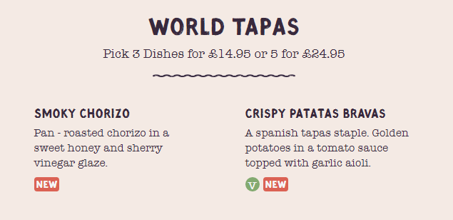
Also, keep in mind that a short menu doesn’t necessarily need its own page. The Monocle Cafe, which we featured in the first section, includes its full menu on the home page. The more quickly visitors can find the information they’re looking for, after all, the happier they’ll be.
Restaurant WebsiteConclusion
Restaurant websites are often tricky to get right. Many restaurants focus on flashiness, complex transitions, and intricate menus to look more appealing, but they neglect usability in the process. However, a lot of businesses have built excellent sites for their customers, and you can easily follow suit.
As far as we’re concerned, restaurant websites should be both stylish and easy to use. With that in mind, we recommend that you apply these three tips while working on your site:
- Include plenty of pictures of your food and location.
- Display your contact information, address, and social media links front and center.
- Showcase your menu in a list or table.
Image credit: Pixabay.
